فهرست محتوای
We will sort the 120 entries by the styles that your users often look for. It is better than using traditional categories like “Best Free Sans-Serif Fonts”. Each style below includes what it is, when to use it, and how to create it step-by-step in the tool. It also covers platform issues and quick tips to improve CTR, dwell time, and shares.
You asked to expand the “The 120 Best Free Fonts” section. It should not just include social-style generators like Facebook Font and Glitch. It should also cover classic typography categories. These categories include Best Free Serif Fonts, Sans-Serif, Display, Monospace, Variable, and Non-Latin fonts.
Here is a reader-friendly expansion that matches search intent. It keeps your copy-paste styles in mind while providing reliable information about real font families and licenses. This blend helps you please two groups at once. Creators need quick, styled text for bios and captions. Designers want proper, brand-ready typefaces.
These “fonts” use Unicode characters and combining marks, not downloadable font files. That’s why they copy and paste into social apps and still maintain a styled look. We reference the relevant Unicode blocks for accuracy.
Why combine social “fonts” and real typefaces on one page
Most visitors arrive with immediate tasks like “bold Instagram bio” or “cursive Facebook text.” Those are Unicode-based styles, not downloadable fonts—great for copy-pasting in apps that don’t support rich formatting.
They connect to Unicode blocks. These include mathematical alphanumeric symbols for bold or italic styles. They also include Combining Diacritical Marks for “glitch” effects. That’s why they render across platforms and allow copying without images.
But a growing slice of your audience also wants real fonts for blogs, landing pages, and brand kits. These need proper licences, such as the SIL Open Font Licence or Apache. They also use modern technology, such as variable fonts. Adding classic categories raises perceived quality, improves AI Overviews coverage, and increases time spent on the page.
Copying styled text vs installing real fonts
- Styled text (your generator): Instantly transforms input using Unicode look-alikes (𝐛𝐨𝐥𝐝, 𝑖𝑡𝑎𝑙𝑖𝑐, 𝒸𝓊𝓇𝓈𝒾𝓋𝑒) or combining marks (glitch). No files to install; copy and paste. Great for social—use sparingly for readability and accessibility.
- Real fonts (for websites/brands): Download webfont files, follow licence rules, and load via CSS. Even free fonts have licences that define what you can/can’t do.
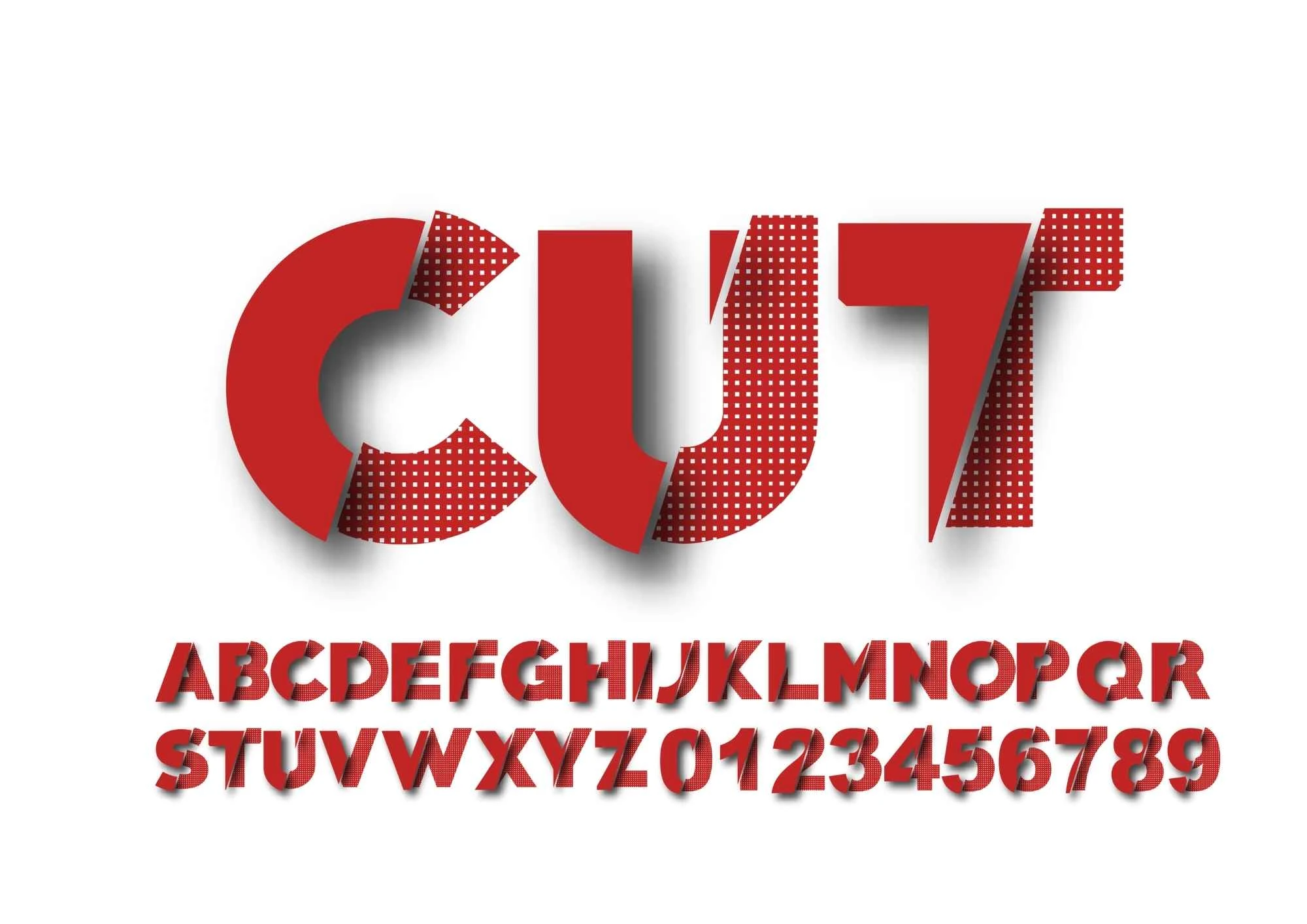
Used Fonts Social styles
Open the tool: fancy font generator and place your headline, bio, or caption in the input.
Choose a Style
You can pick from different styles. Here are some options:
- Facebook font
- Small font
- Glitch text
- Stacked text
- Italic text
- Extra bold fonts
- Cursive italic font
- Fancy fonts
- Fancy symbol generator
- Cursed text generator
- Feel free to switch between these options!
- Copy & paste into your target app (Instagram bio or caption, Facebook post, X/TikTok description, WhatsApp status). Remember: social platforms render these styles because they’re Unicode characters, not true formatting.
- Character limits: Before you finish your Instagram bio or long caption, make sure you stay within the platform limits. It will help you avoid truncation. (Most guides agree: captions up to 2,200 characters; bios up to 150.)
Instagram Bio & Caption Guardrails
Know the limits: most reliable guides say bios should be about 150 characters. Captions can be up to 2,200 characters. Check your final text. Special Unicode characters still count toward the limit.
Make it skimmable: Break long captions into short lines; use styled words to signpost the message, not to replace it. Facebook and Instagram do not support bold or italic text in regular posts. Many tools use Unicode "fonts" as a workaround. Please don’t overdo it.
VIP Bios Stylish Font
To make your Instagram profile look premium, use the best Instagram VIP bios. This stylish font shows you how to choose a VIP-style bio. It looks great, is easy to read, and fits the 150-character limit.
The 120 Best Free Fonts
Search intent match: Users type “Facebook bold text”, “glitch text”, or “Instagram cursive font” more often than “best free serif”. Organising by style outcomes makes your section immediately useful.
Task completion: The tool solves the job in seconds—type → choose style → copy—which outperforms static font lists.
AI-Overview readiness: Each style’s “what/when/how” explains intent, usage, and guardrails. It is the content that AI overviews usually show.
Serif Fonts
Why serifs: Serifs often feel bookish, trustworthy, and comfortable in longer reads. There isn’t one clear winner for “readability”.
Context, size, and usage are all important. However, designers still prefer serifs for articles and premium brand tones—present options with examples and pairings instead of absolute claims. Different research methods greatly affect how we do UX and the results we get.
How to choose quickly:
- Look for full families (Regular/Italic + multiple weights).
- Prefer broad language support if you publish internationally.
- Verify the licence (OFL/Apache) for commercial projects.
Why this helps your page: You address the need for “best free fonts” for real design work. It reduces pogo-sticking and boosts your authority.
Upgrade for global content: Showcase families designed for publishing in multiple scripts. An example is Noto Serif CJK. It is free and open source.
The design accommodates Chinese, Japanese, Korean, and Latin scripts. They designed it to prevent the “ransom note” look when mixing these scripts. Even though the story is older, it still shows why free serifs can be good for businesses.

Sans-Serif Fonts
Why sans: Clean forms, great at small sizes, and easy on modern screens. Use sans for navigation, forms, buttons, and dashboards. Please provide 6 to 10 reliable, well-kept families and record their licences (OFL/Apache). This way, teams can ship without legal issues.
Pairing move: Use Sans for body text and Serif for headlines to create a modern editorial look. You can also switch to a friendly user interface with classic section titles.
Variable option: When possible, suggest using the variable build. It allows teams to show only the axis values they need, like weight, width, or optical size, from one file.

Display Fonts
Why display: High personality at large sizes; perfect for hero sections, posters, video thumbnails, and social covers. Warn readers: display faces rarely make good body text. Offer a few sub-genres (geometric, condensed, high-contrast, retro) and provide pairings with a neutral sans or serif.

Monospace Fonts
Why mono: Lined-up characters and clear differentiation between look-alike glyphs (0/O, l/I/1) help with code snippets, API docs, and technical pricing tables. Suggest 3–5 with good punctuation, ligatures (optional), and webfont availability. Confirm the licence and link back to the official source every time.

Variable Fonts
Why variable: One font file exposes continuous axes—weight (wght), width (wdth), and optical size (opsz)—so designers can fine-tune typography without loading multiple static files. It can reduce requests and provide precise type tuning across breakpoints. Include a one-liner on opsz (optical size) so readers know why headlines and body text can use different “size-aware” shapes within the same family.

Multilingual Fonts
Why it matters: If your brand publishes in Arabic, Devanagari, Cyrillic, Greek, or CJK scripts, pick families built to harmonise across scripts. Use Noto and other well-maintained open-source projects as examples of pan-script consistency.

Advanced Notes
Unicode basics behind fancy text
The bold/italic variants you see in “Facebook font” come from Mathematical Alphanumeric Symbols—a block that contains styled Latin and Greek letters/digits (U+1D400–U+1D7FF). They’re distinct characters, not formatting, which is why they render consistently across platforms.
Combining marks power glitch looks
“Glitch” styles layer characters from Combining Diacritical Marks and related blocks, placing accents above/below letters to create distortion. Rendering is browser-dependent; keep text short for clarity.
Accessibility and visual clarity
No matter how stylish the text, contrast remains non-negotiable: 4.5:1 for body text and 3:1 for large text. Also, be mindful of line length and size ramps for mobile reading.
Social limits and truncation
For Instagram, plan for the commonly referenced limits so your styled bios and captions don’t get cut off—then preview on mobile before posting.
When you need real fonts
If you’re designing a website/UI where you control CSS, consider loading actual webfonts under clear licenses (e.g., SIL Open Font License on Google Fonts). That’s different from Unicode “styles” and ideal for brand systems.